
Hahn is one of the most well-known brands in Australia and, in the Lion portfolio, one of the most important.
As one of the pioneer alcoholic drinks in the ‘better for you’ space, Hahn SuperDry was one of the first in the range to offer low-carb, lower-alcohol and gluten-free options. Consumers love the taste but often fail to identify the ‘better for you’ benefits.
Hahn SuperDry was due for a brand refresh and a more straightforward way to present the offer.
—
This project was created while I was the Australian Creative Director of Landor & Fitch.
Client
Lion
What we delivered
Brand guidelines
Packaging design
Visual identity system
Creative team
Julius Cruickshank, CD
Patrick Carroll, DD
Darren Mulkerrins, SD
Credits
Product renders - Limehouse

Solution
We refreshed the Hahn design system, stripping the elements back to their core assets. The recognisable bands were retained but simplified to increase prominence and standout, allowing the variant name and benefit to be hero on pack.
A beer that says what it is. How good.
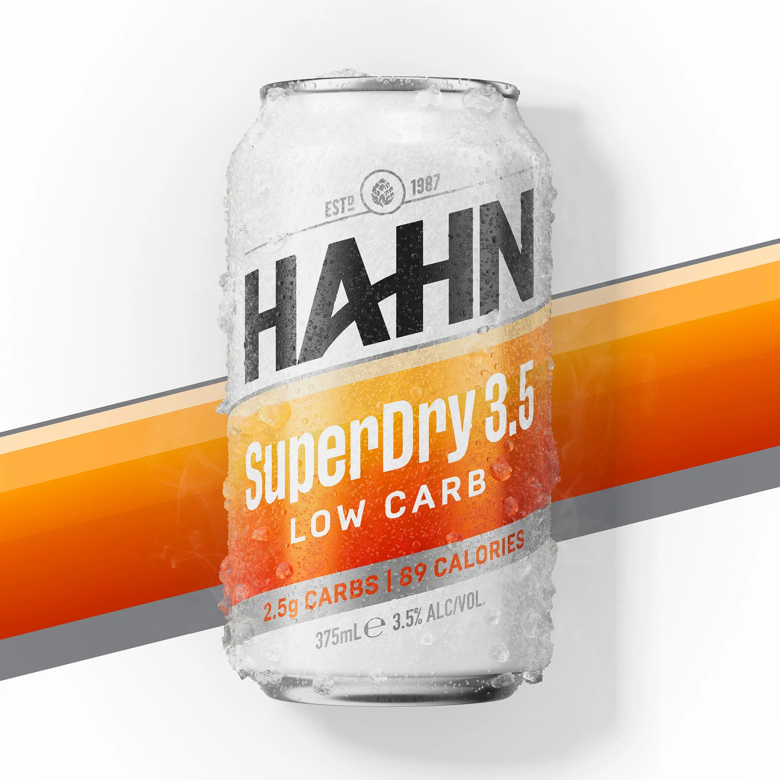
Distinctly Hahn
The Hahn logo is iconic, but the Landor & Fitch team knew that the core wordmark would benefit from reducing the noise around it and refining the shape. Rounded corners and drop shadows were removed, and the curved skylines retired.
The updates allow the Hahn logo to display more prominently while maintaining recognisability.

