Rothfield homepage update
These four design concepts explore ways to refresh the Rothfield homepage and give the video and opening statement greater prominence. Each uses different layouts and colour treatments while staying true to the existing site’s visual identity. All four concepts are presented in desktop and mobile views.
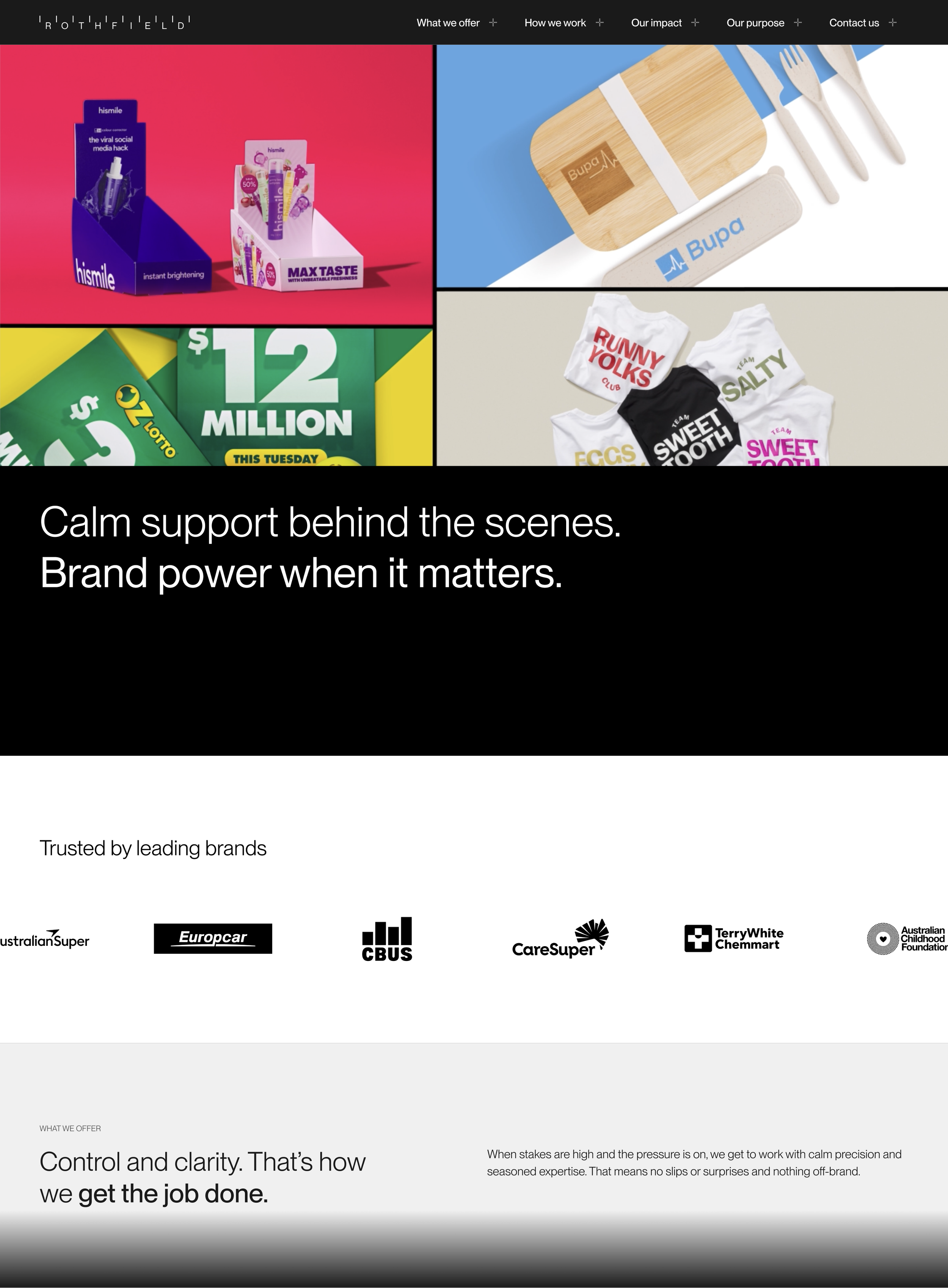
Rothfield homepage design 1
This design places the video at the top, followed by the opening statement. Both the navigation bar and statement panel have solid black backgrounds, with the statement aligned to the top of its panel to sit closer to the video.
The logo carousel uses wider spacing between logos, which are now pure black rather than medium grey.
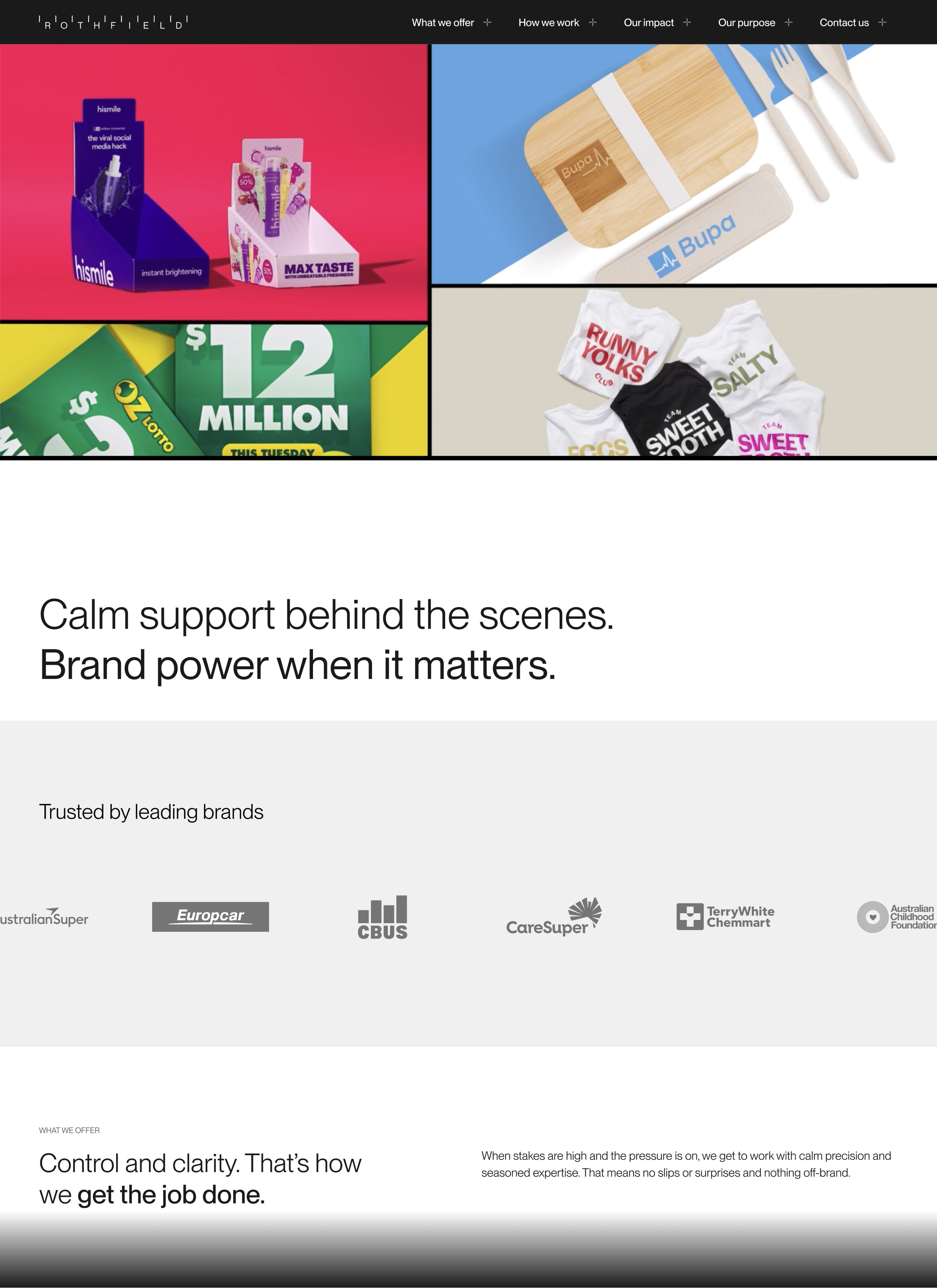
Rothfield homepage design 2
This layout places the opening statement below the video, with black text on a white background. The logo carousel uses a light grey background with muted dark grey logos for a harmonious look. The top navigation bar stays black, and a thin black line runs along the bottom of the video, matching the thickness of the black dividers within the video itself.
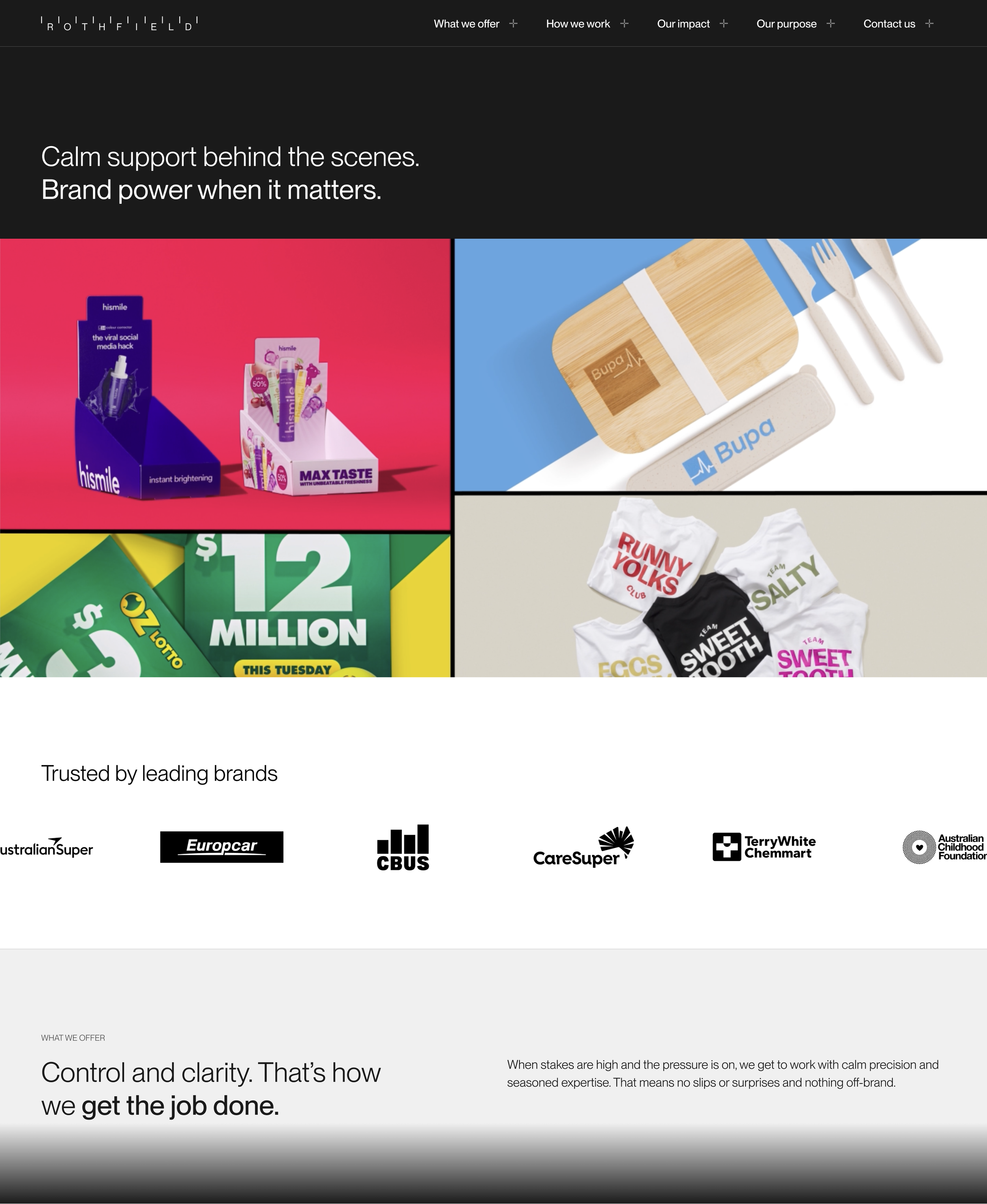
Rothfield homepage design 3
This approach keeps the opening statement at the top, with a shorter panel and smaller type for an elegant composition. Both the statement and navigation use white text on dark grey backgrounds.
The logo carousel uses black logos on white, contrasting with the Control and Clarity panels that follow.
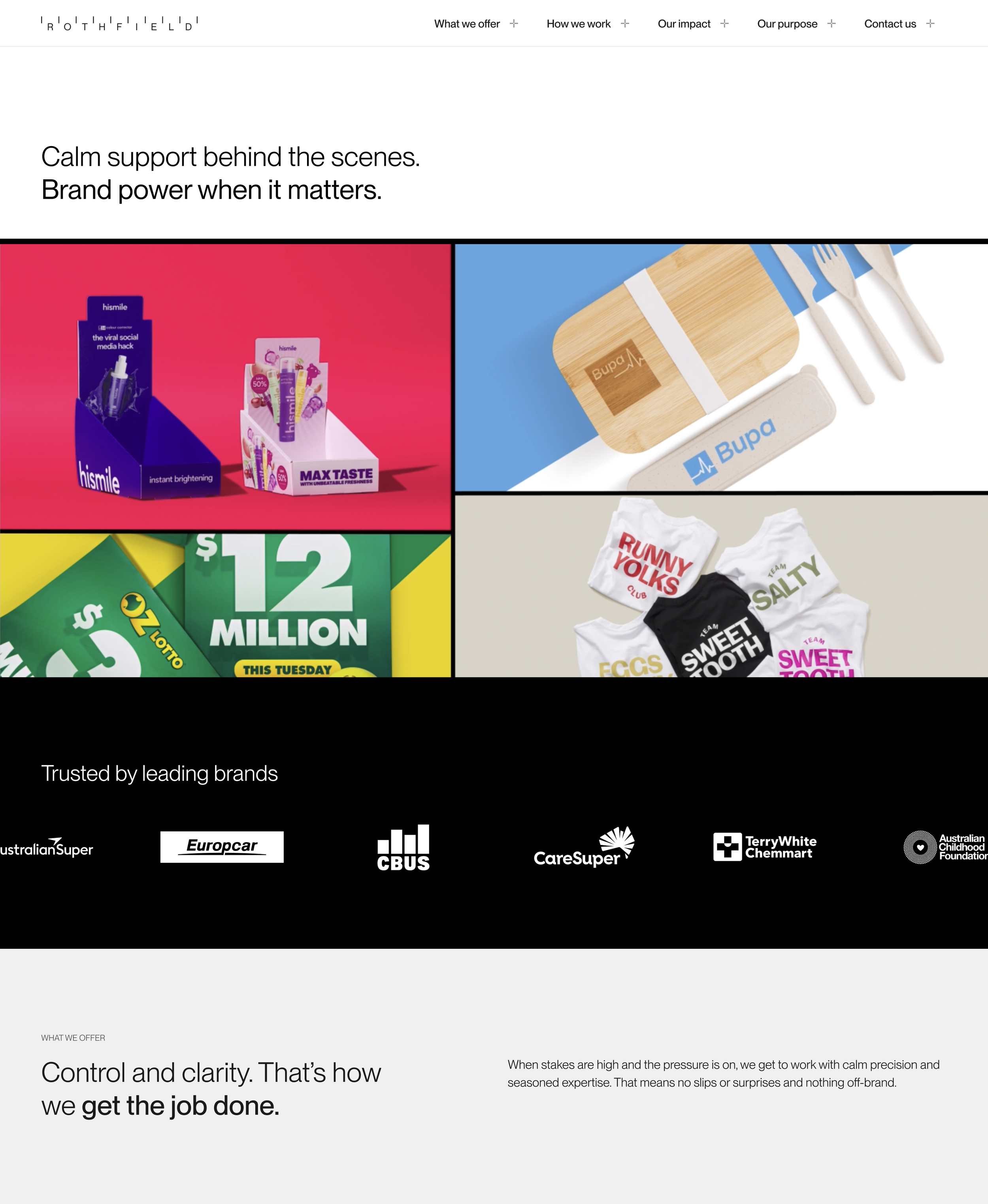
Rothfield homepage design 4
The navigation bar and opening statement sit at the top of this design, using black text on white backgrounds to create a bold introduction in a shorter panel, while keeping much of the video visible above the fold on both desktop and mobile. Black bars along the video’s top edge clearly separate it from the white panels above.
The logo carousel reverses this colour scheme, using white logos on a black background to create a strong visual contrast.