Client
Drivetime
My role
Product designer
Creative Director
App designer


The Drivetime Mark
Since the core function of the app was to read aloud your messages and alerts as you drive, the logo needed to describe this. A simple grid system was developed upon the main logo, and a greater icon family was built.
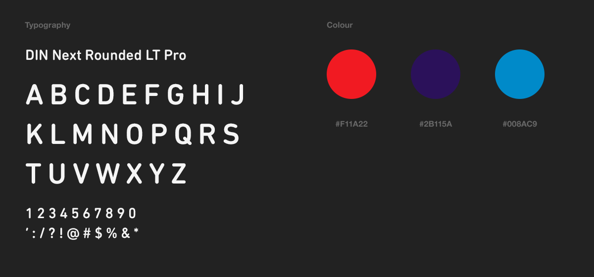
The Drivetime font — DIN Next Rounded LT Pro — was originally designed for German traffic signs, and the Drivetime colours are red, purple and blue, as used by the BMW M series.
These details are neat and subtle nods to the automotive Industry.