
A rethink from the ground up. Strategy, naming and identity working in sync to bring purpose, warmth and precision to a serious tech player.
Biometric Solutions had the tech and the trust, but not the brand to match. The name felt clinical, the identity forgettable, and the story wasn’t being told.
I was brought in from Sydney to Copenhagen to help change that. Working with the team in Denmark and naming agency Everything Will Be Fine in Glasgow, we developed a new strategy, renamed the company and its products, and created a brand that feels calm, confident and built for people.
The result is Mirra.
Client
Biometric Solutions
What was delivered
Brand Strategy
Brand Identity
Company Naming
Product Naming

A brand that leads with trust, not speed
Before changing the name or building any visuals, we worked out what the company really stood for. The strategic insight was simple. While others rush to scale, Mirra earns trust by doing things properly. We kept the focus on the people behind every interaction and let that guide everything from tone to product design.


From Biometric Solutions to Mirra (and everything it touches)
We worked with Glasgow-based agency Everything Will Be Fine to rename the company. The name Mirra is short, calm, and loaded with meaning. It’s a nod to reflection and responsibility. A mirror for the values the company lives by. We then built a full product naming system underneath it. Mirra Go, Mirra Collect, Mirra Vows and others. Each one expresses the role it plays in people’s lives.

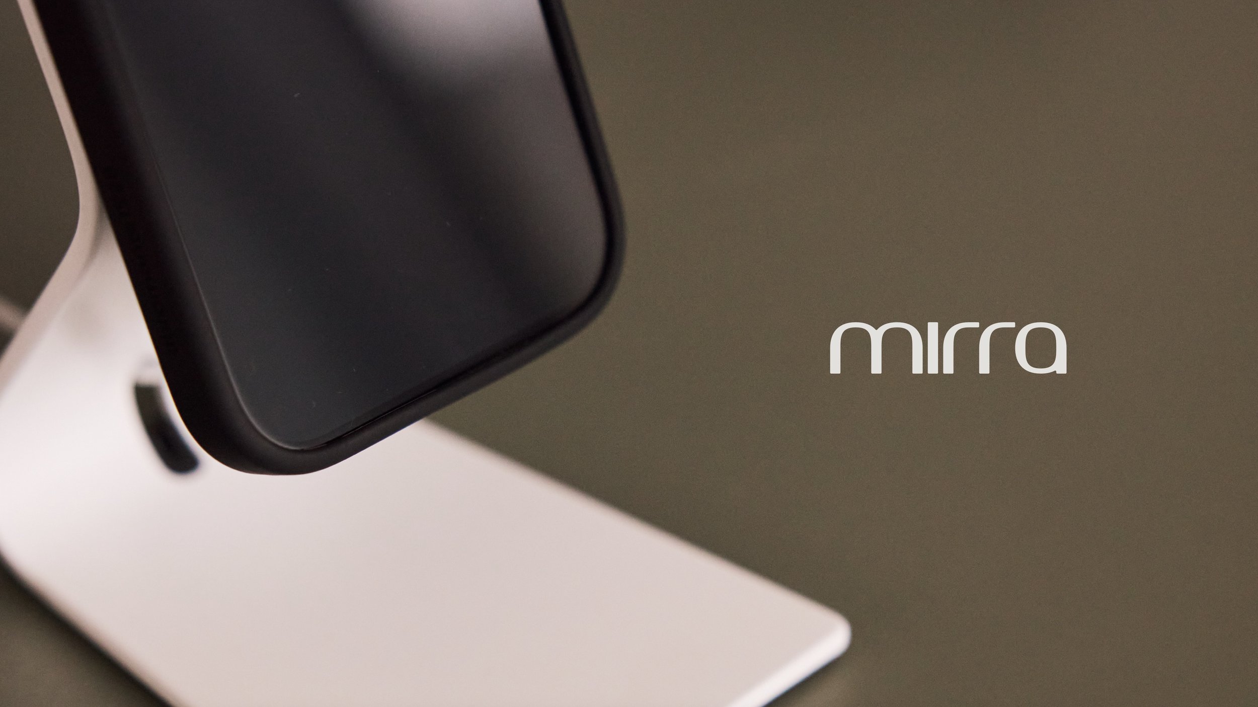
Precise. Grounded. Still human.
The wordmark is built on a repeating quarter curve. That curve runs through every letter and gives the mark its balance. It’s designed to feel confident without being loud. There’s no fluff—just quiet rigour and thoughtful detailing.


An icon family built from the same DNA
Every icon uses the same geometry as the wordmark. That keeps things feeling calm and connected. The line style is light and measured. Just enough to be useful. Never more than it needs to be.


Warm, tactile, and built to last
We developed two complementary palettes. One is grounded and earthy. The other brings more contrast and edge. Both reflect Mirra’s focus on empathy, trust, and clarity. The primary typeface, FK Grotesk, brings the tone to life with a balance of character and calm.

Soft structure, quiet identity
The line patterns follow the same geometry as the logo. They’re abstract but grounded. Structural, but never stiff. These patterns give layouts rhythm and personality without shouting for attention.


Hi Julius,
Just wanted to say thank you. What I saw today has moved me.
Have a great weekend.
Mvh,
Alex

Alex Ramskov Johannsen
Mirra CEO and Founder

