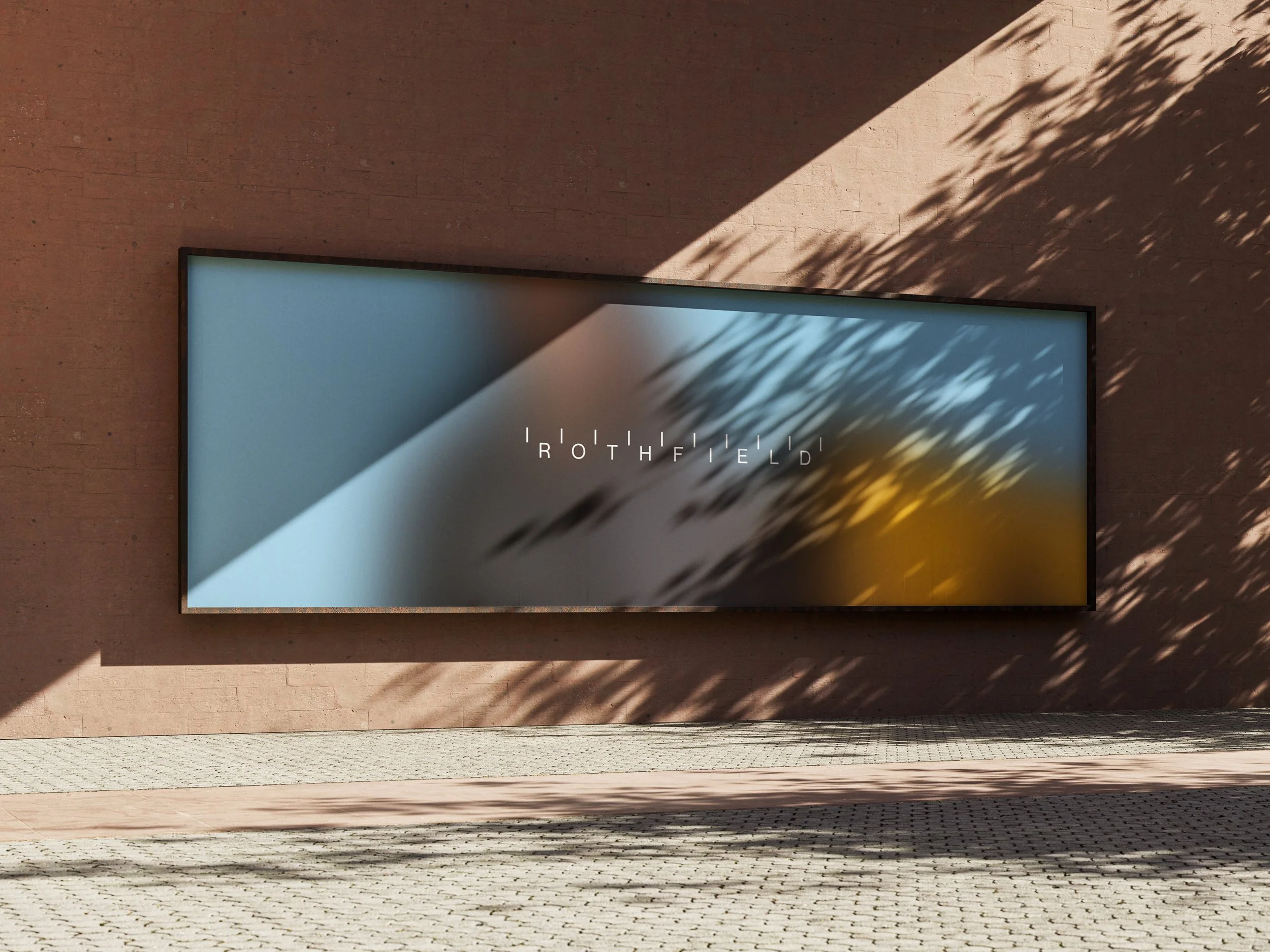
A brand built with precision.
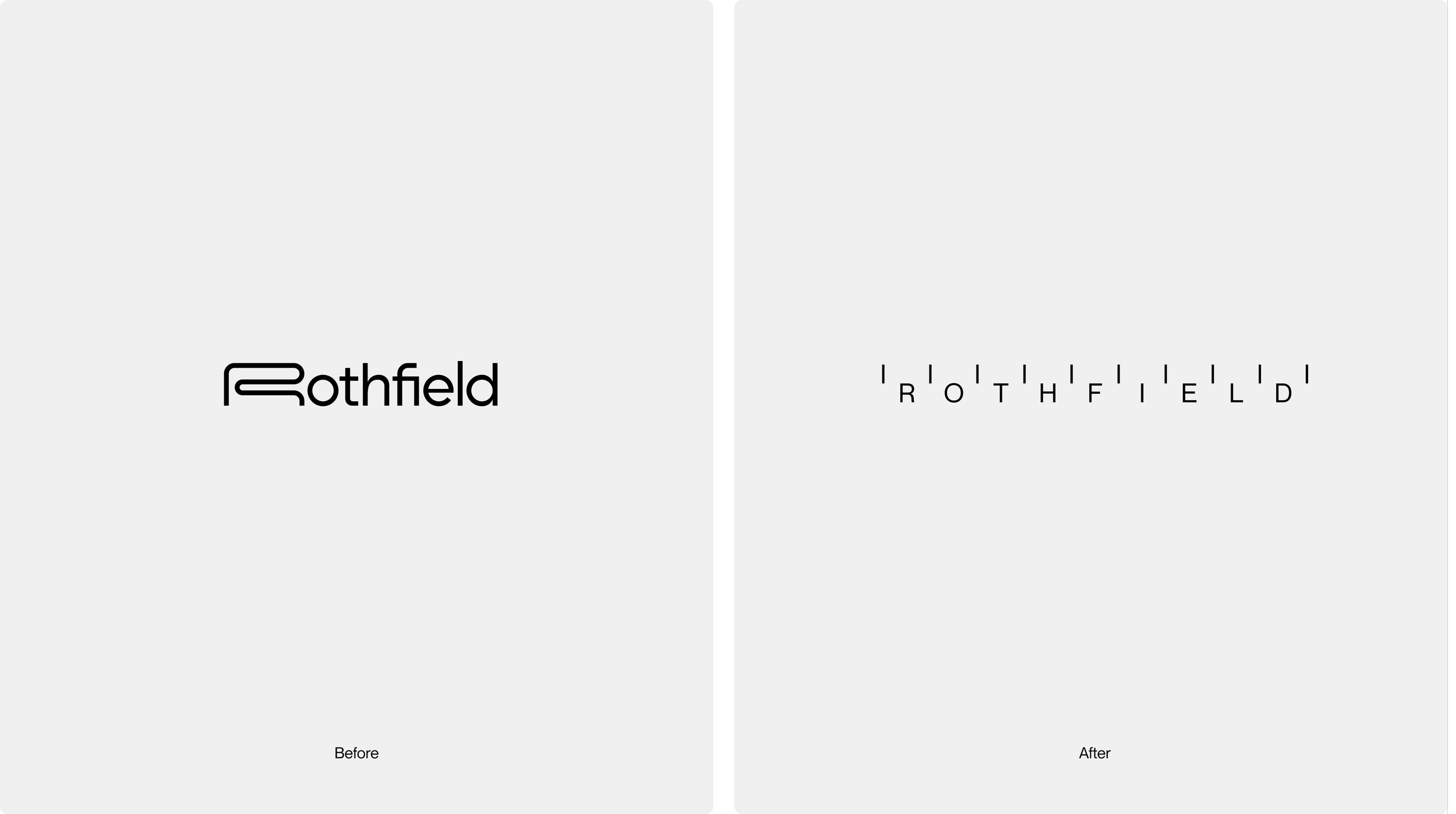
Rothfield has come a long way from its roots in print management, promotional products and logistics. Today, it works behind some of Australia's biggest brands, bringing together procurement, technology and production to make ambitious marketing happen. The business had evolved. Its identity needed to catch up.
Working alongside Stake Reputation, who developed the brand strategy and positioning, we created a new visual identity that reflects the business Rothfield has become. One that brings the discipline of procurement together with the ambition of marketing. Precise, confident and unmistakably Rothfield.
Client
Rothfield
What was delivered
Brand identity
Icon family
Art direction
Graphic devices
Illustration
Collateral
Brand Strategy
Stake Reputation

Key takeaways
1. Building a brand around calibration
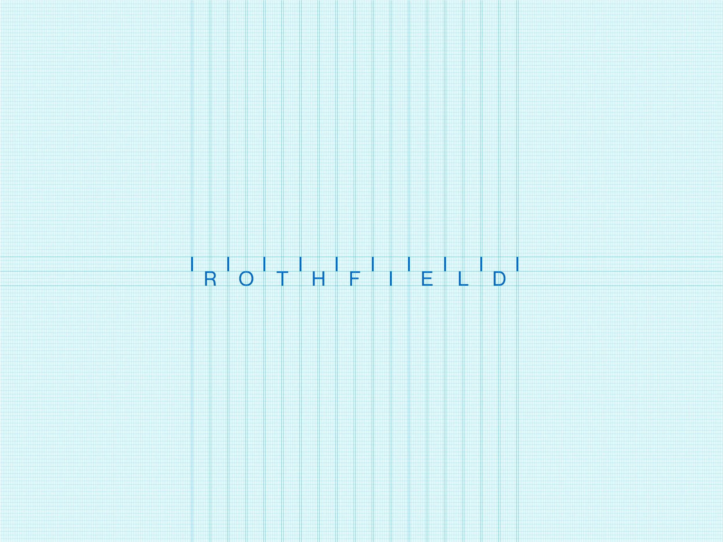
Rather than relying on familiar logistics imagery, we took inspiration from the way Rothfield works. Measurement, alignment and attention to detail became the foundation for a distinctive identity that works across everything the business does.
2. Bringing the human side of Rothfield into focus
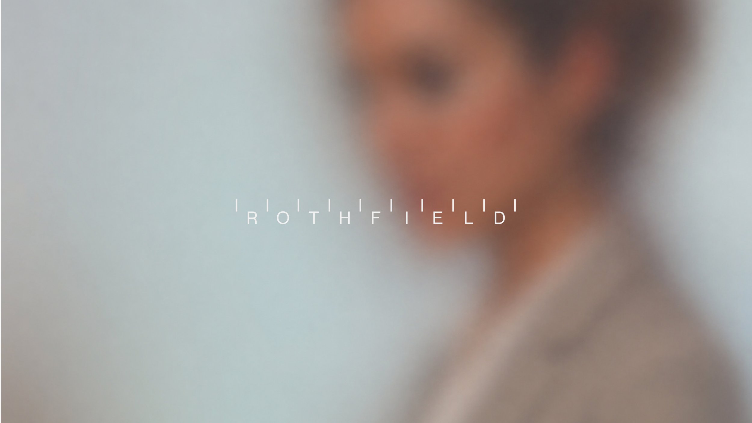
Rothfield's people make big things happen, often without being seen. We brought this idea to life through People in Motion, a photographic and graphic treatment that celebrates the people behind the work, without taking attention away from the clients they support.
3. Creating an identity that works in the real world
A brand needs to do more than look good. We created a practical set of tools that Rothfield's team can use every day, from presentations and proposals to digital products and communications. One connected identity, with the flexibility to work wherever it's needed.
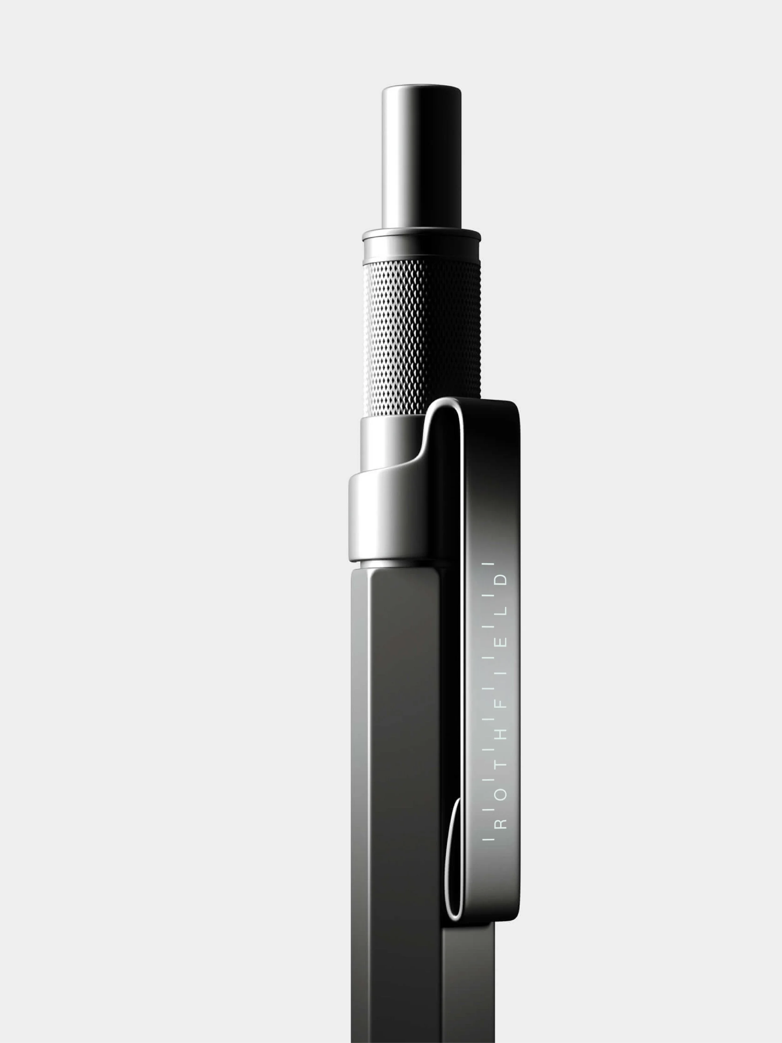
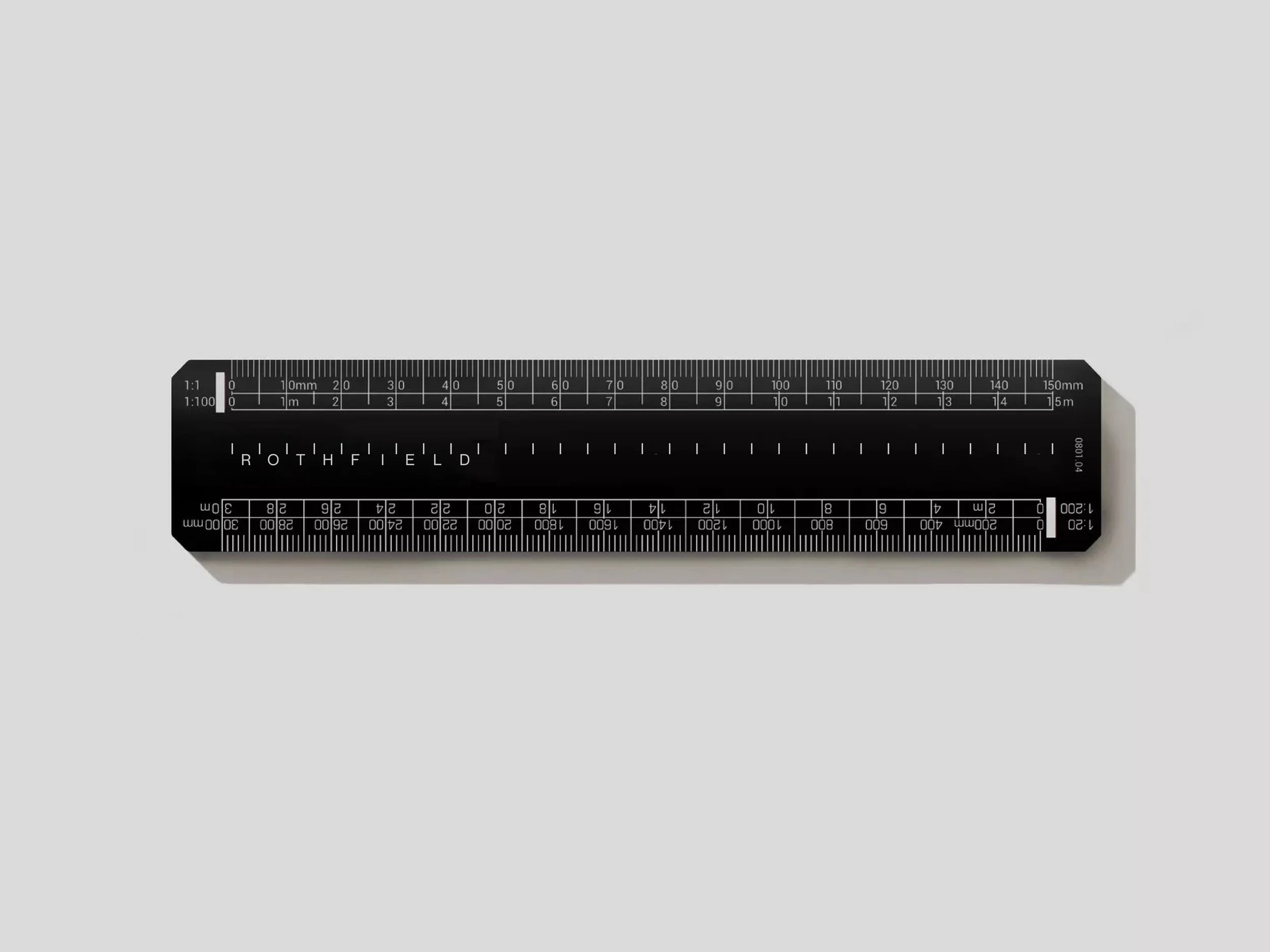
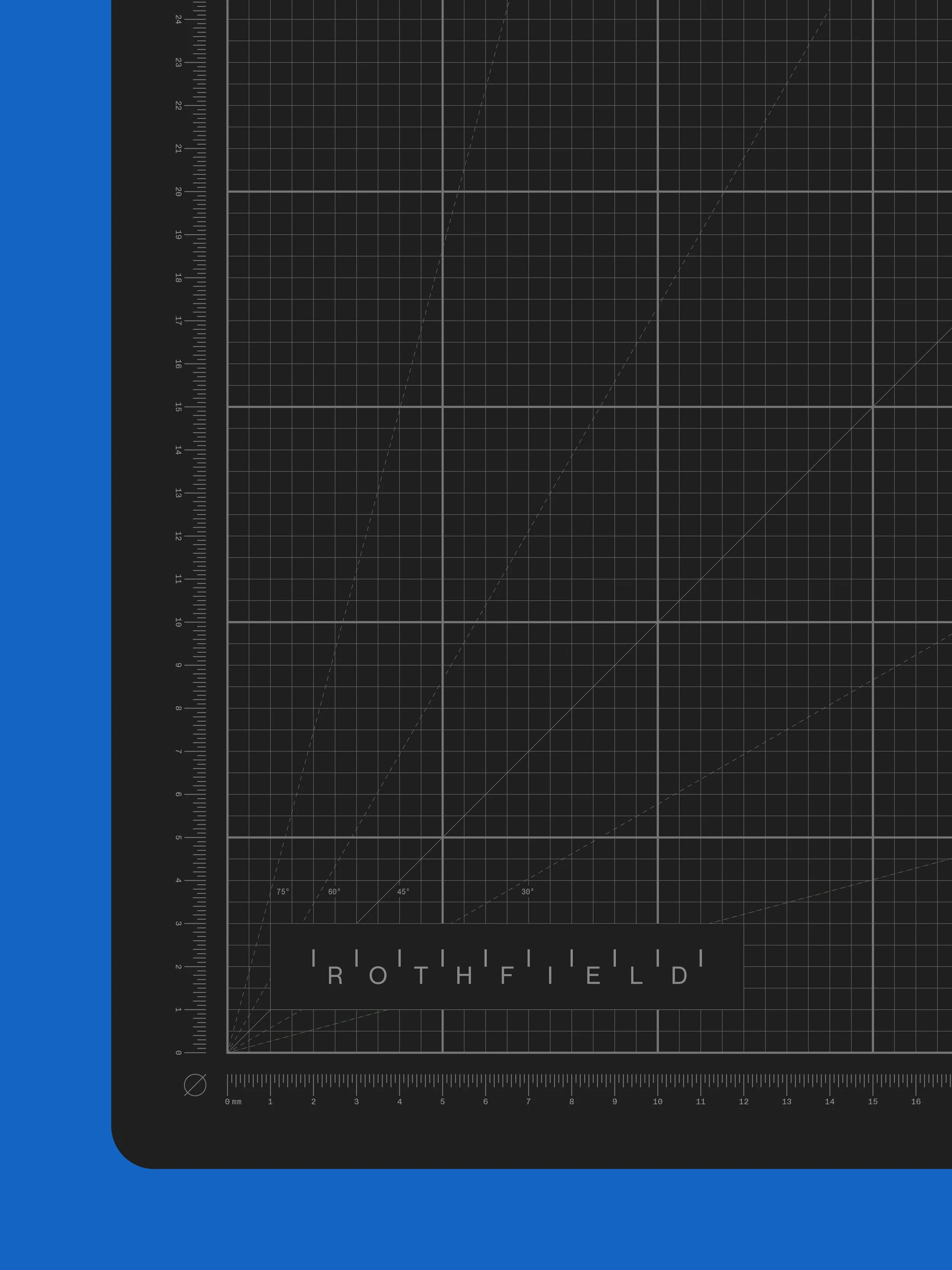
A visual system built around calibration
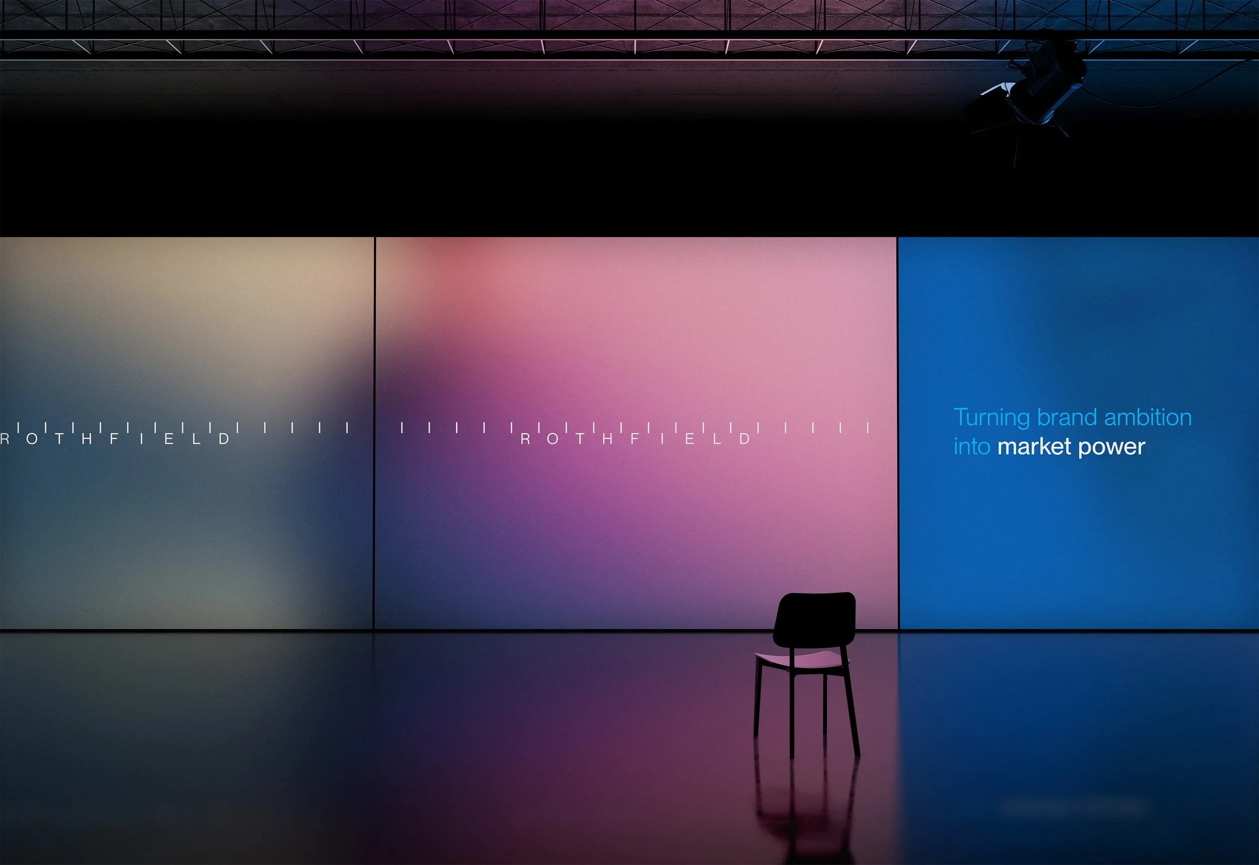
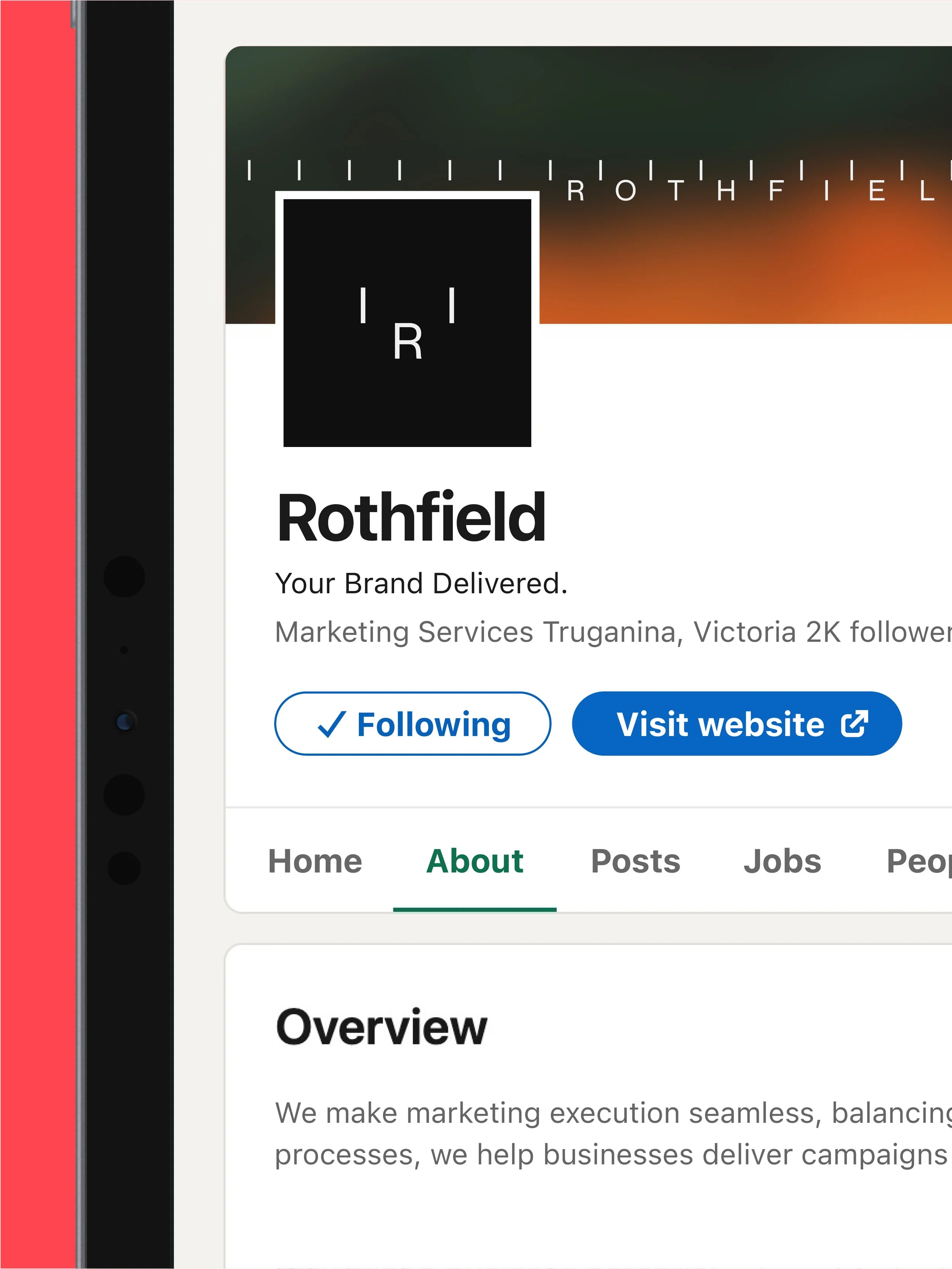
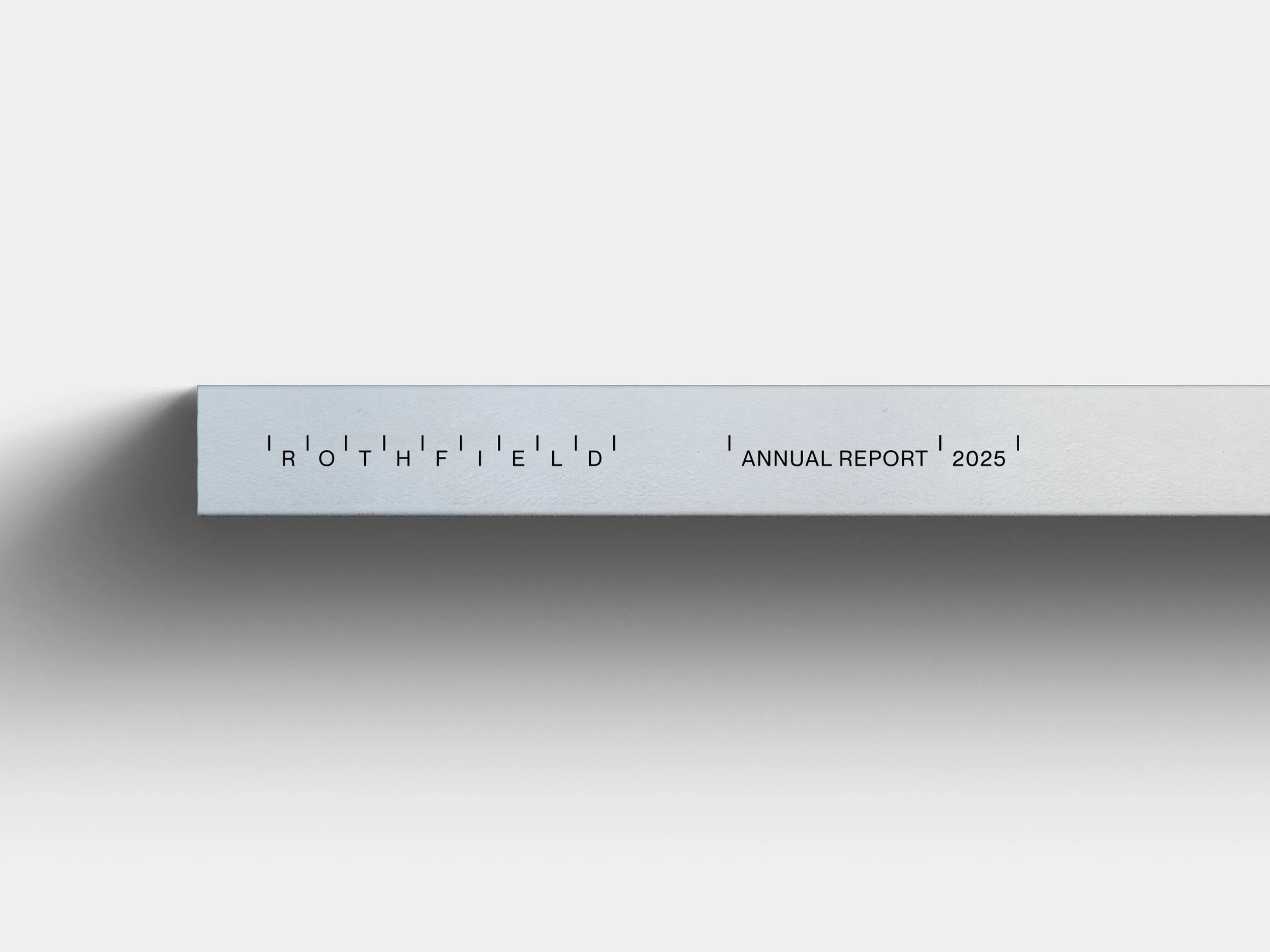
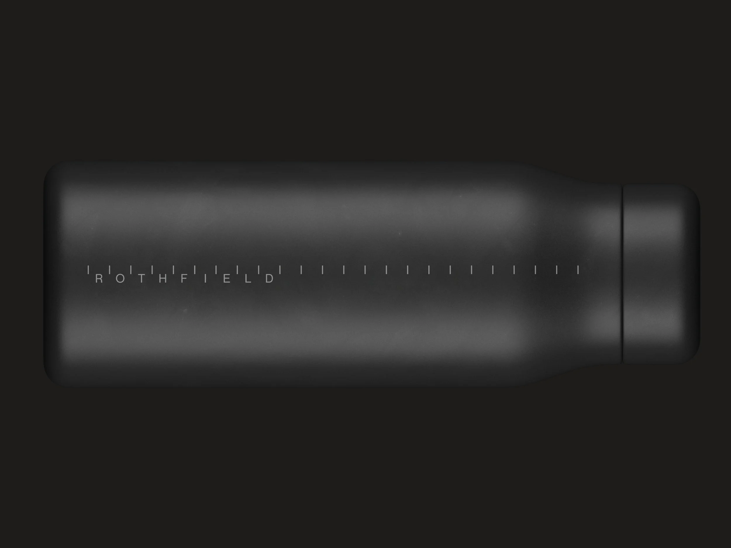
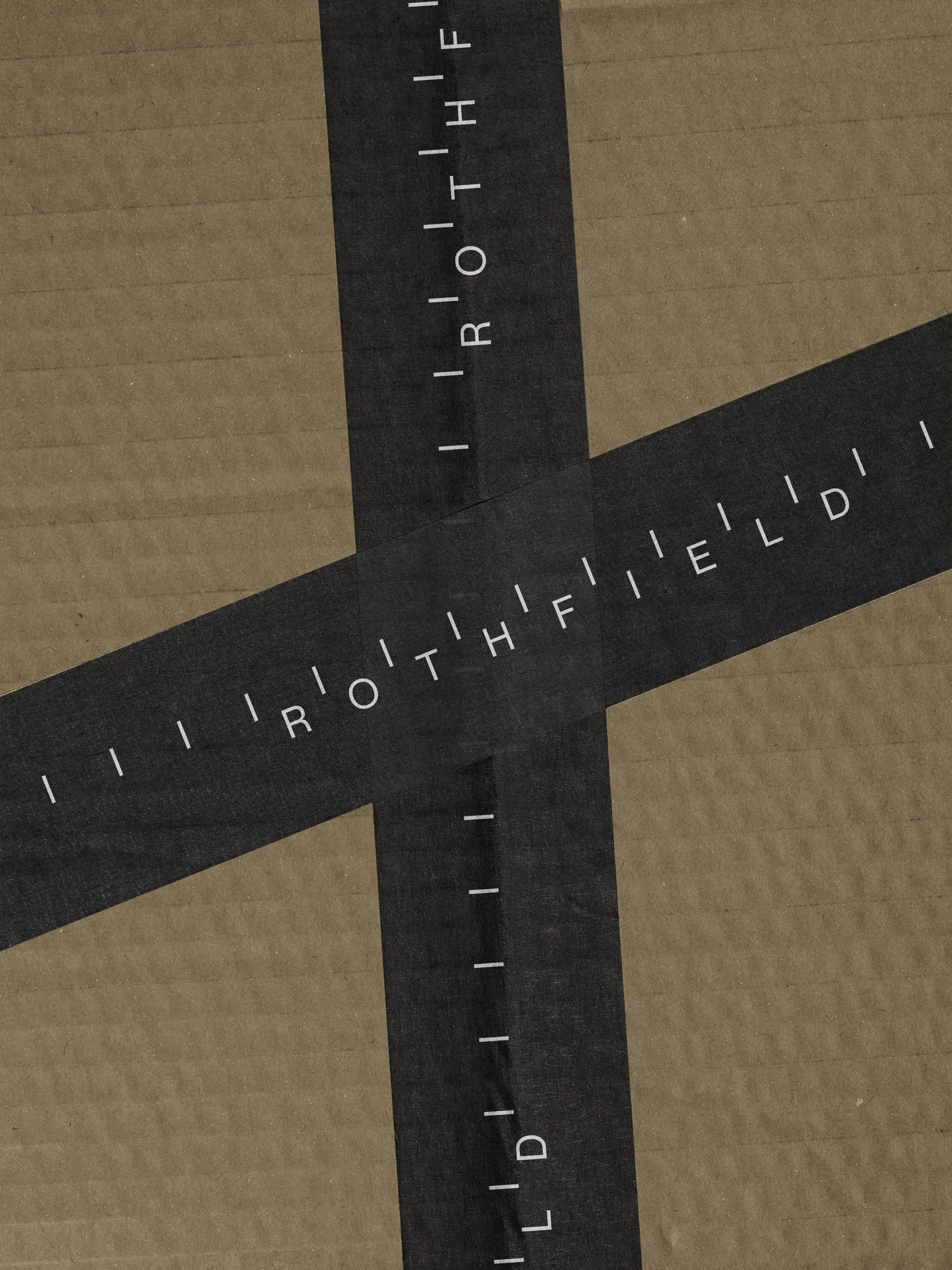
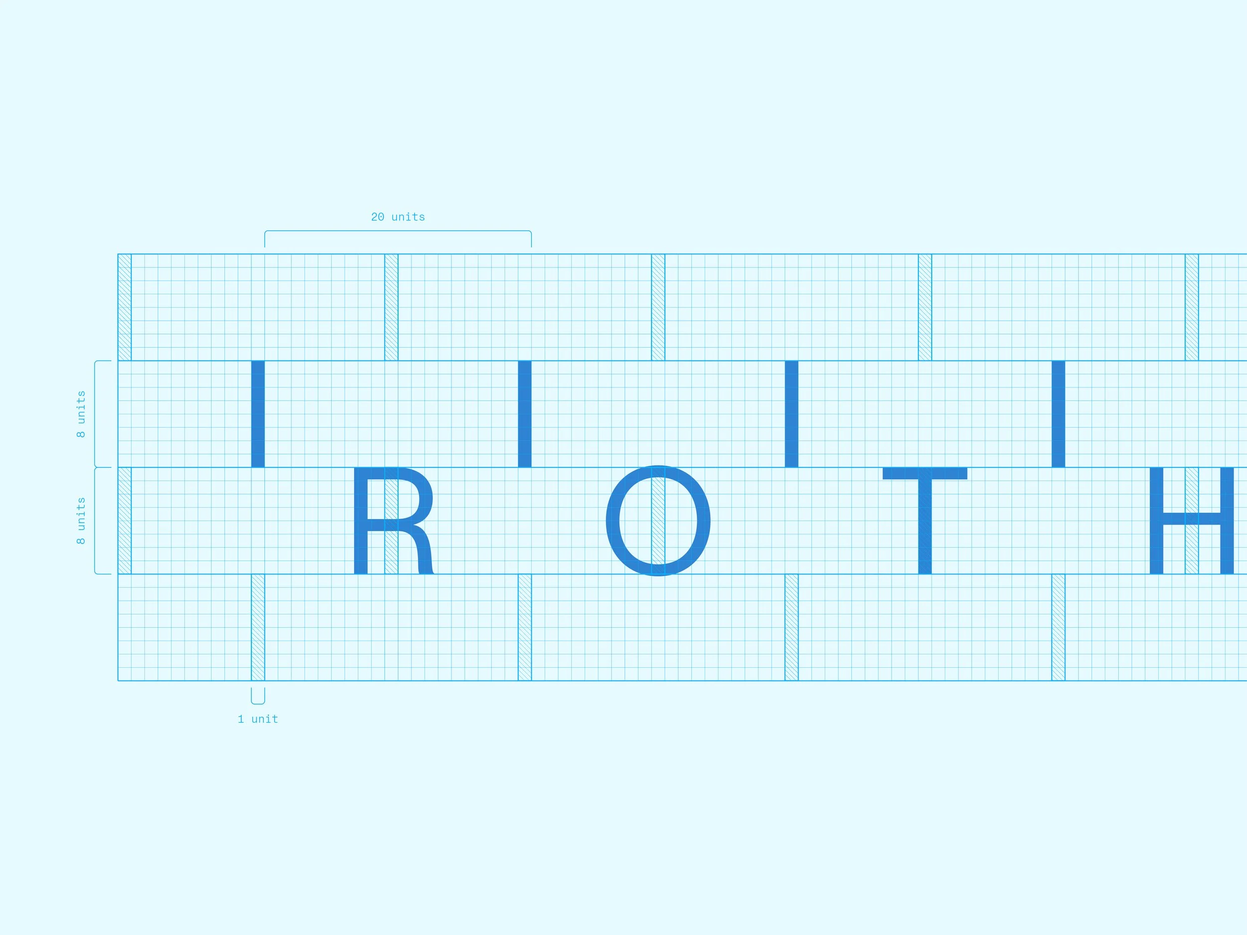
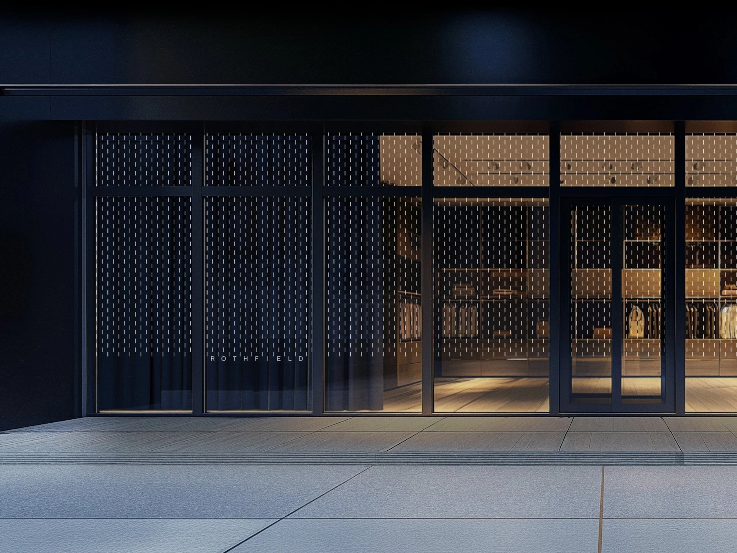
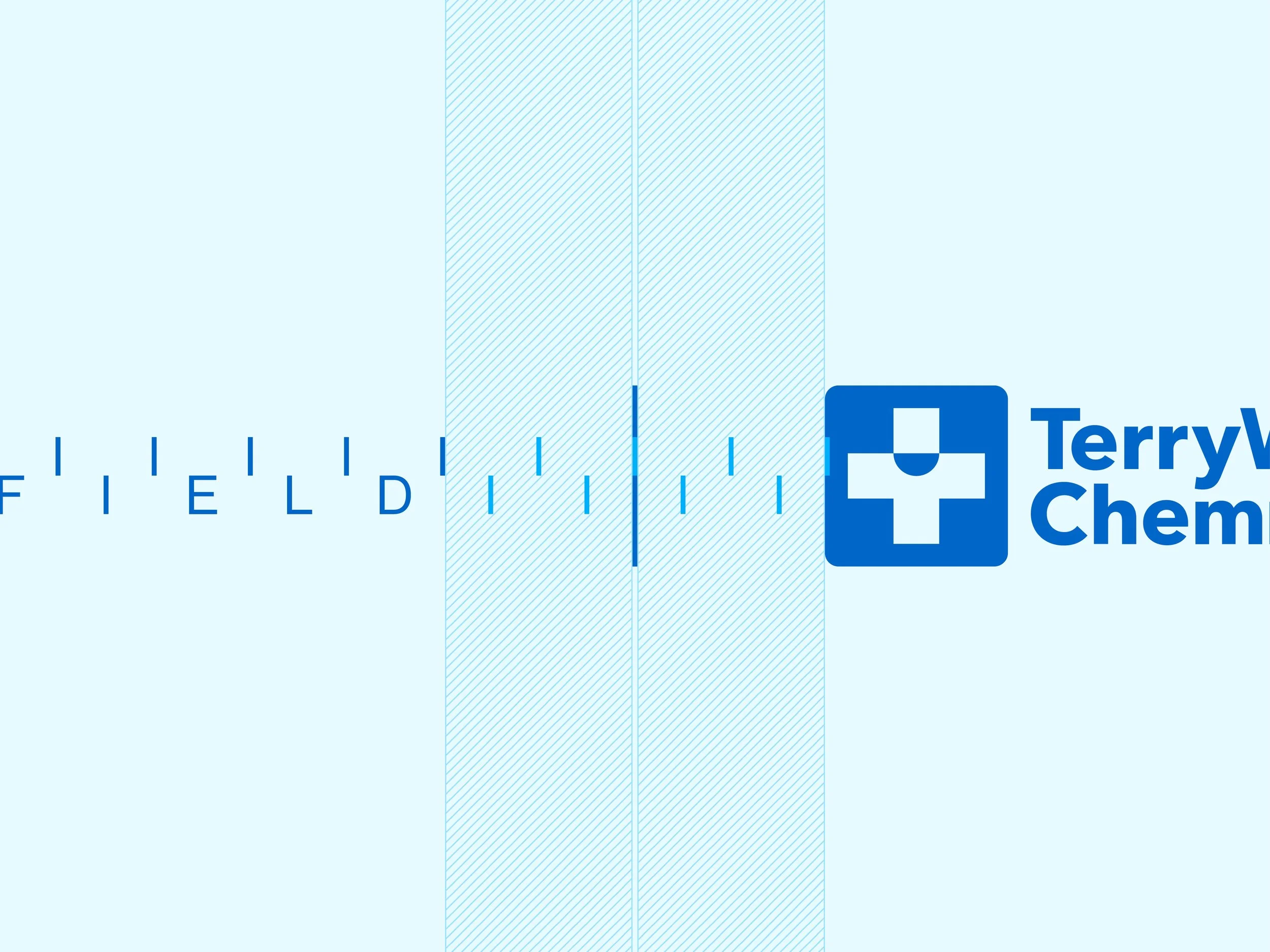
Calibration became the starting point for the identity. A series of carefully measured lines, markers and intervals that give the brand its own recognisable look.
It's more than a graphic treatment. The same thinking shapes the layouts, typography, motion and even the smallest details. The result is a system that feels considered and consistent, without becoming rigid or predictable.
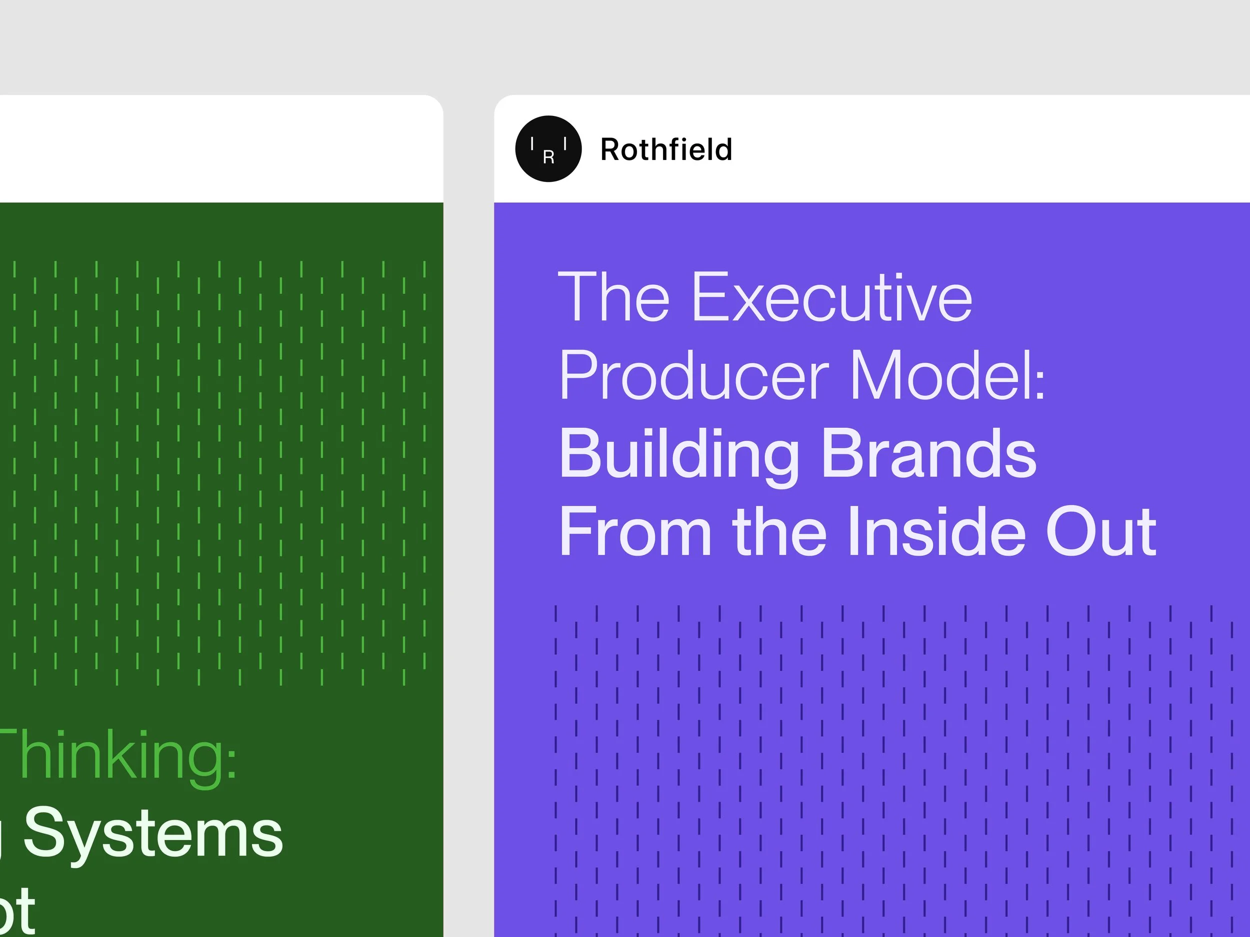


People in Motion: working behind the scenes
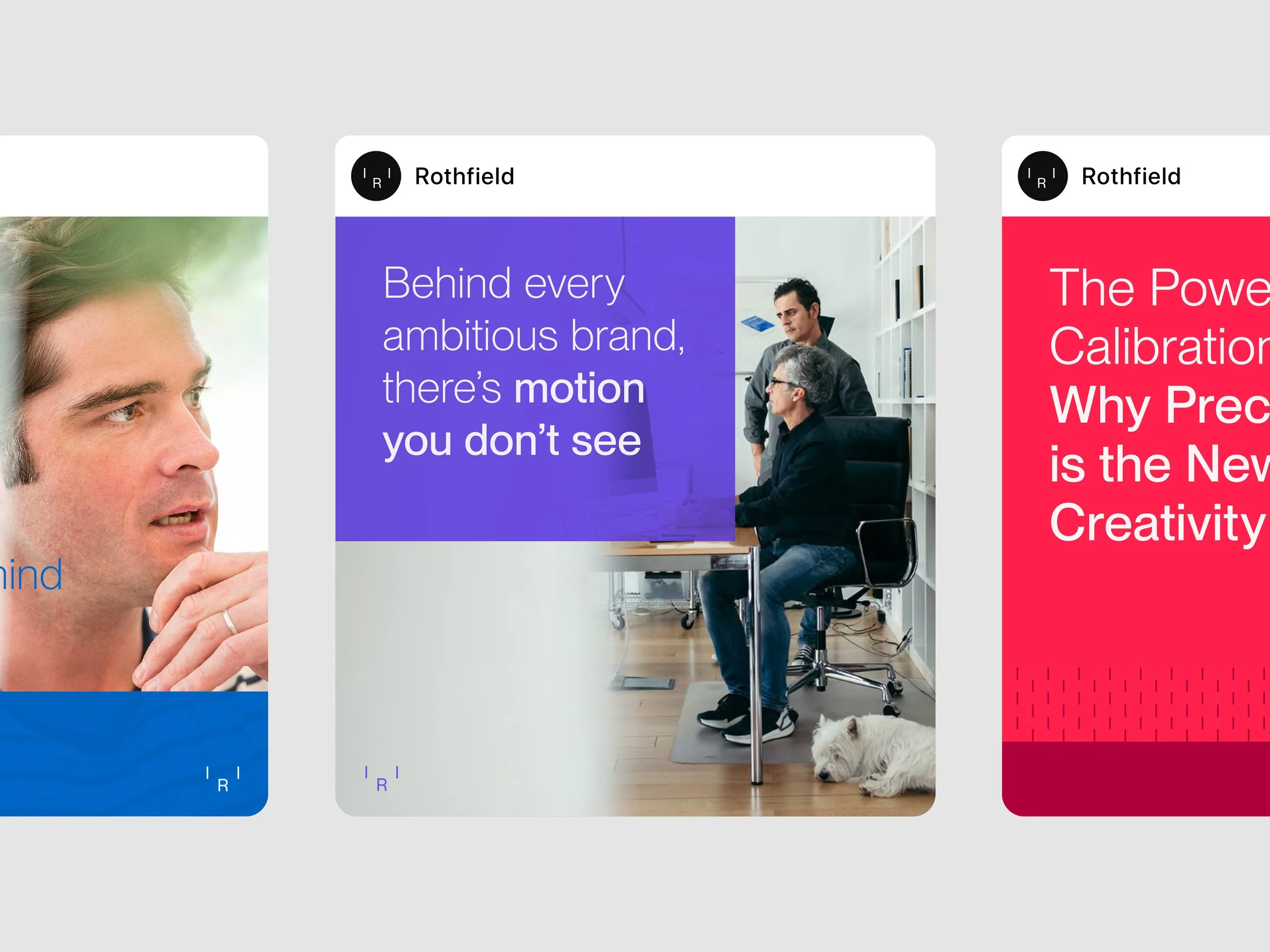
Rothfield is often the team making everything happen in the background. They're not there to take the credit. They're there to make their clients look good.
We captured this through People in Motion, a graphic device featuring blurred figures, movement and shifting colour. The people are always present, but never quite in focus.
It's a deliberate contrast to the sharp lines of the calibration system, bringing a human side to a brand built on precision.


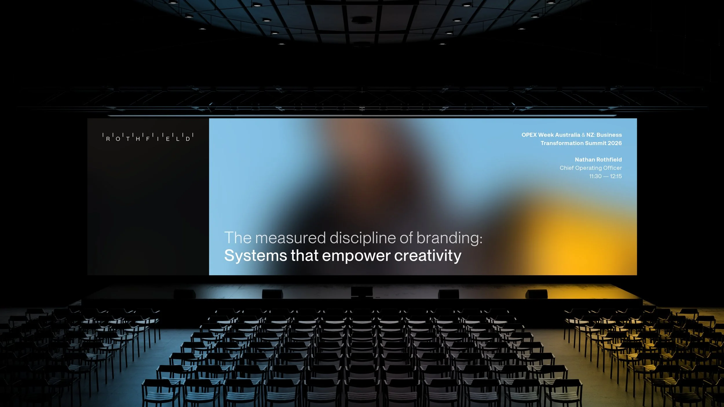
The new brand articulates what Rothfield has now become, giving us a system that works as confidently in front of our client base as it does in the hands of our team. It's given the whole business a shared sense of how we show up.
Nathan Rothfield
Chief Operating Officer

An icon for every part of the business
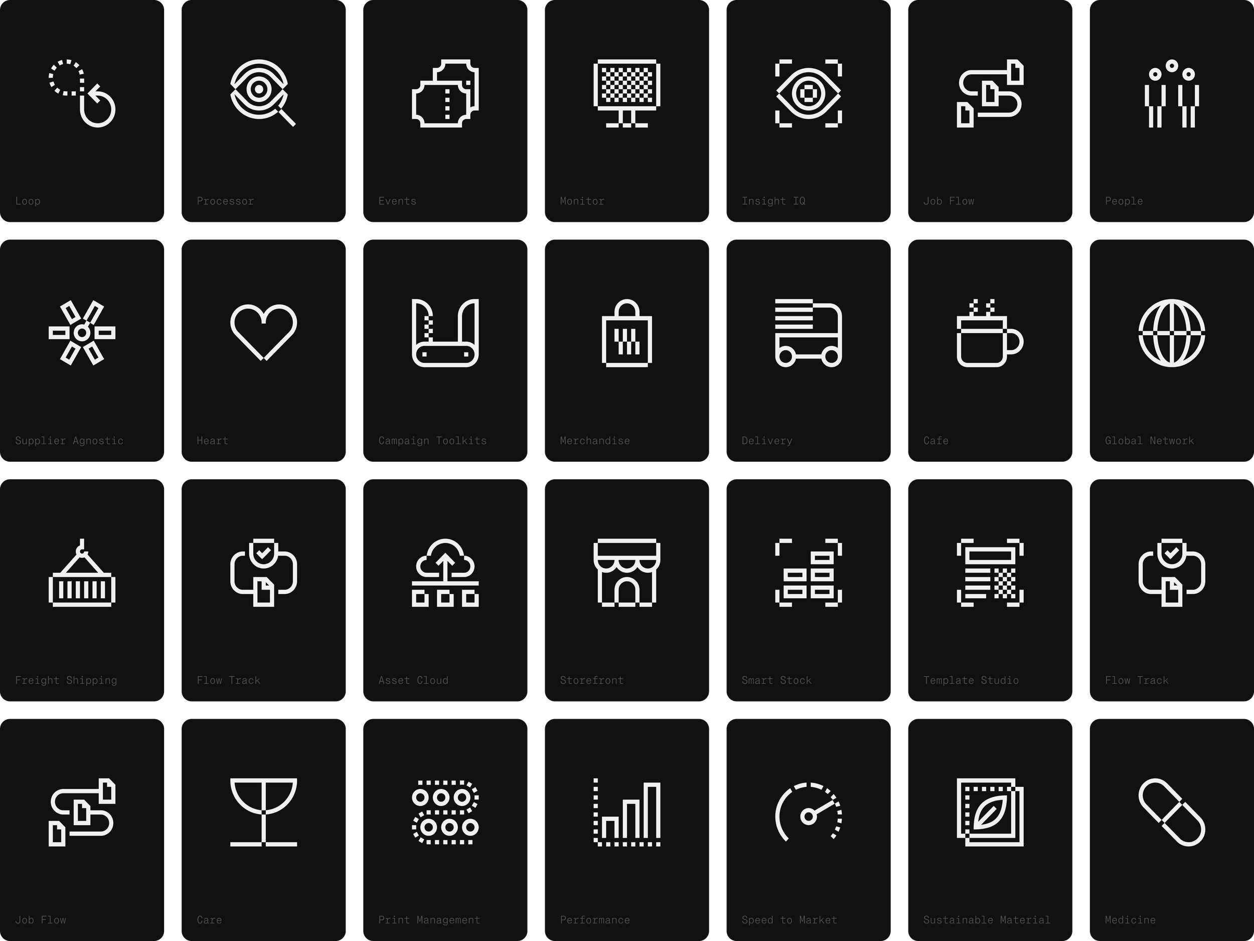
With services spanning procurement, production, logistics and technology, Rothfield needed a clear way to communicate what it does.
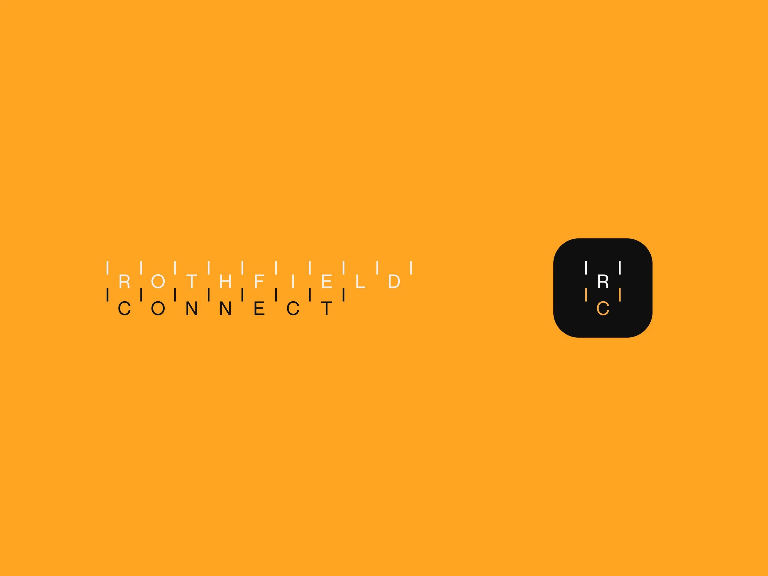
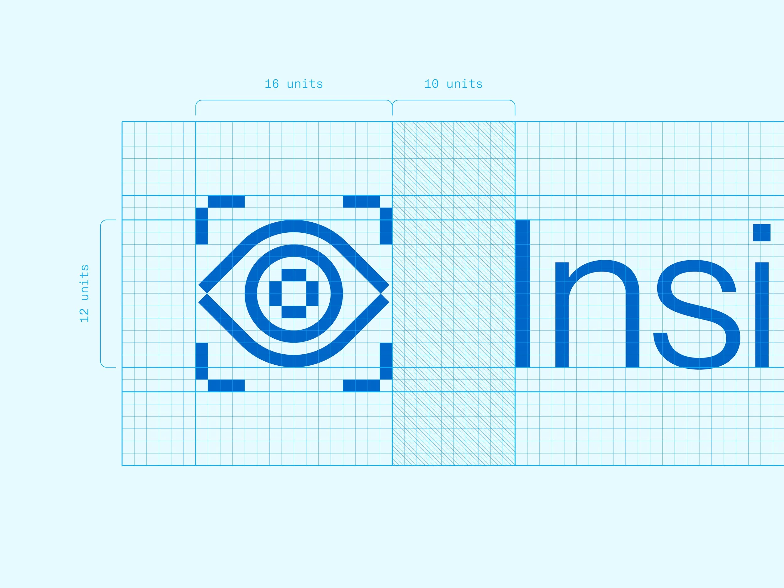
We developed a bespoke family of icons, each built using the same geometry and proportions as the wider identity. From core services to Rothfield Connect and digital interfaces, everything feels part of the same family.

A new identity for a new chapter
The new identity gives Rothfield a brand that better reflects the business it is today. Confident enough to stand on its own, but flexible enough to work alongside the brands it supports.
Launched in late 2025, the identity now appears across Rothfield's website, presentations, tenders, social, signage and merchandise. More than a new look, it's given the team a consistent way to present the business, whatever the audience or application.
A brand built to work behind ambitious brands, and help them shine.